


Entelect Theme

Module Documentation

A living library of every module used across the Entelect corporate site. Each entry explains, in plain terms, what the module is for and what you can change — followed by a live example of every look it comes in. Modules are listed alphabetically.

27 modules · same theme, tokens & components as the production site

Awardsawards

A centred showcase of the awards and recognition your company has won, each shown with the awarding body's logo, the award name, and the years won.

Use this section to show off the awards and recognition your company has earned. Each award appears between a pair of laurel leaves that are added automatically.

What you can change

  • The small line of text above the heading, and the heading itself (you can make part of the heading stand out in a brighter colour)
  • Add, remove, or reorder awards
  • For each award: upload the awarding body's logo, type the award name, and list the year or years it was won
  • Whether soft decorative glows appear in the background, and the spacing above and below the section
Live example

Our Awards

Recognised by companies
that set the standard

Best Company to Work for

2014201520162017

Fastest Growing Companies in Africa

2022202320242025

Employer of Choice

20242025

Best Company to Work for

2025

Best Graduate Development Programme

2019

Business Areasbusiness-areas

A short section pointing visitors to other parts of the business, shown as two cards with a heading, some text, and a link each.

This section sits near the foot of a page and nudges visitors towards other parts of the business, like careers or the foundation, using side-by-side cards.

What you can change

  • The heading at the top of the section
  • The cards — add, remove, or reorder them. Each card has a title, a short blurb, the label for its link ("See the roles"), and where that link goes
  • Each card's decorative line-art graphic: pick "Career", "Foundation", or "None"
  • Whether to show the soft decorative background glows, and their colour and position
  • The section's background colour and the space above and below it

A card with no link set simply hides its link, so you never end up with a link that goes nowhere. Two cards fill the row neatly on a desktop screen.

Live example

Learn more about other areas of our business

Career Opportunities

We're always on the lookout for talented professionals who are ready to make an impact.

See the roles

The Entelect Foundation

The Foundation today consists of not-for-profit charities as well as the Entelect group companies who are working towards uplifting communities.

Learn more

Capability Bannercapability-banner

A promo banner with a short heading, intro line and button, sitting above a wide edge-to-edge image.

Use this to spotlight a key message or offer, with a headline, a short intro, a button, and a big picture running across the bottom.

What you can change

  • The small label that sits above the heading
  • The heading — you can make part of it stand out in a brighter colour
  • The short paragraph under the heading
  • The button text and the page or link it points to (leave the button text empty to hide the button)
  • The wide picture shown across the bottom
  • Flip image horizontally — mirror the picture left to right without re-exporting it. Leave it off to show the artwork exactly as supplied, and keep it off whenever the picture contains readable words or signage
  • Rotate image — turn the picture by up to 180 degrees either way. 180 stands it upside-down; 90 or 270 put it on its side, which can crop a wide image
  • The background colour and how much space sits above the section
  • The soft glowing circles in the background — turn them on or off and change their colour, size and position
Live example

AI Applied Engineering

Boards demand AI productivity. Regulators demand auditability. CIOs and technology leaders need reliable software delivery – without sacrificing security or governance.

Entelect has embedded engineering teams inside the world's most demanding enterprise environments, helping them embed AI across the Software Delivery Lifecycle (SDLC) – safely, at pace, and without exposure.

Abstract engineering visual

Certificationscertifications

An expandable list of your company's certifications and compliance credentials, where clicking a title opens a short statement about each one.

Shows your certifications and compliance credentials as a tidy list that visitors can click to open and read.

What you can change

  • The small label above the heading and the heading itself
  • Each certification's title and the short statement that appears when it's opened
  • Whether that certification shows a "Read our statement" button. This is off by default and should stay off for the short blurbs — switch it on only where there's a long, full policy worth opening in a pop-up (the Anti-Modern Slavery statement is the one that has one). A certification with the button off simply shows its blurb.
  • The button label under each statement (default "Read our statement") — it opens a pop-up for that certification
  • The slides inside each certification's pop-up — add more than one to let visitors page through them with Prev / Next
  • An optional logo and reference link on each slide of the pop-up
  • Add or remove certifications from the list
  • Turn the soft background glow on or off
  • The space above and below the section
Live example

Certifications

Compliance & Credentials

As a certified Level 1 B-BBEE contributor, we are recognised for our commitment to broad-based black economic empowerment across ownership, skills development, and enterprise growth in South Africa.

Our Information Security Management System covers the design, development, delivery, and support of our end-to-end technology services and solutions, as well as our supporting IT infrastructure, cloud platforms, and business operations globally.

We are committed to preventing modern slavery and human trafficking in our operations and supply chain, in line with the UK Modern Slavery Act 2015, and we hold our partners to the same standard.

As an accredited Living Wage employer, we ensure everyone working for us in the UK earns a wage that meets the real cost of living, going beyond the government minimum.

Our Cyber Essentials Plus certification demonstrates independently verified protection against the most common cyber threats, safeguarding our clients' data and our own systems.

We acknowledge the Traditional Custodians of the lands on which we work, and pay our respects to Elders past and present, recognising their continuing connection to land, waters, and community.

CTA (Call To Action)cta

A call-out band that nudges visitors to take the next step, using a button, a sign-up form, or a featured announcement card.

A call-out band that encourages visitors to take the next step.

What you can change

  • The message wording
  • The button text and where it links to
  • The background colour of the band
  • Swap in a sign-up form when you want visitors to subscribe (with an optional picture)
  • For the announcement look: the headline, the smaller line under it, and its link
  • For the announcement look: which globe spins behind the card — Globe 1 (blue/green, upright) or Globe 2 (mint/teal, tilted, slower reverse spin)

Comes in 3 looks

  • A simple message with a button
  • A message with a sign-up form and an optional picture
  • A striking announcement card with a headline, a sub-line and a glowing globe backdrop
Live example — Default

Avoid failure — speak to our team of software engineering specialists today.

Live example — Newsletter signup
Live example — Announcement (Gartner glass card)

Entelect Identified in the 2025 Gartner® Tool

Vendor Identification for Custom Software Development Services Report

Read the article

CTA Formcta-form

An invitation-to-contact section, usually placed just above the footer, that pairs a short message with a form so visitors can get in touch.

A get-in-touch section with a short invitation on the left and a contact form on the right, sitting on a soft glowing background.

What you can change

  • The small line of text above the heading
  • The heading, including which words stand out in white
  • The short paragraph below the heading
  • Which contact form appears, and the thank-you message people see after they send it
  • Which globe spins behind the section — Globe 1 (blue/green, upright) or Globe 2 (mint/teal, tilted, slower reverse spin)
  • Turn the soft background glows on or off, and adjust their colour, size and position
  • How much space sits above and below the section
Live example

Let's talk

Let's talk about what you're building

With 25 years of experience, Entelect helps leading banks build modern banking solutions with the rigour mission-critical environments demand.

Customer Storiescustomer-stories

Shows a row of customer or case-study cards — each a photo with the client's logo, a title and a "read the story" link — to spotlight your proven work.

A dark showcase strip of customer story cards under a heading, used to highlight the client work you're proud of.

What you can change

  • The small line of text above the heading, and the heading itself
  • An optional button and where it goes (for example "Explore all customer stories")
  • Each story card: its photo, the customer's logo, the title, and the "read the story" link text and destination
  • The photo is a link too, not only the "read the story" wording underneath it — visitors can click the picture itself, and it goes wherever you pointed that card's link
  • Which part of a photo stays in view if it gets cropped
  • Add or remove story cards, and reorder them
  • The background colour, the top and bottom spacing, and the soft background glows

Comes in 3 looks

  • Featured — the first story is one big card with the smaller cards lined up beside it
  • Equal — four equal-sized cards side by side, which turn into a swipe carousel on phones
  • Home — the first story shows as a large photo with its text (including a short description) beside it, then the rest sit in a row underneath
Live example — Featured (one big + narrow cards)
Live example — Equal (four equal cards)

You might also like

Related stories

Explore all customer stories
Live example — Home (first story with copy beside it)

Customer Stories

Partnering with Banks, Insurers, and Embedded Finance Providers to solve their most complex challenges

Explore all customer stories

Delivery Storiesdelivery-stories

A list of client success stories where each row opens up to reveal the full story of how a project was delivered.

Use this section to showcase a series of client success stories. Each story sits in its own row that visitors click to expand and read the full write-up.

What you can change
  • The small label and the main heading above the list
  • Each story's client logo and the colour of the little box behind it
  • Each story's title
  • An optional picture that shows when a story is opened
  • The three parts of each story: the background, what was done, and the result
  • Add as many stories as you like, or remove ones you don't need
  • The section's background colour, the space around it, and the soft background glows
Live example

Our Work

How we've delivered

Bupa

Context

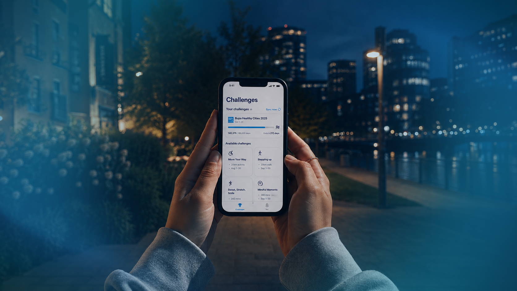
Bupa needed to deliver a seamless mobile experience for its Healthy Cities wellness programme, ensuring timely launch while managing complex dependencies across platforms and partners.

Approach

Entelect deployed a multi-regional team to design and deliver scalable native mobile applications, integrating with third-party wellness platforms and enabling accurate tracking and user engagement features.

Outcome

The solution launched on time, mitigating delivery risk and enabling Bupa to strengthen corporate partnerships through a reliable, scalable, and engaging wellness platform.

Context

Glacier set out to transform its intermediary experience by replacing fragmented systems with a unified, scalable digital platform.

Approach

Entelect delivered a modern, user-centric platform built on React and .NET, integrating key tools into a seamless journey and aligning with existing design systems for consistency across the business.

Outcome

The platform onboarded thousands of users and processed billions in policy value, reducing operational complexity and improving speed, accuracy, and user satisfaction.

Context

Sasol sought to move beyond a legacy plastic-card loyalty programme to deliver a more engaging, mobile-first customer experience – while consolidating fragmented data, enabling personalisation, and ensuring long-term scalability and security.

Approach

Entelect partnered with Sasol to design and deliver the Sasol Rewards App. The app integrated with loyalty engines, customer identity systems, and campaign platforms to enable seamless onboarding, real-time rewards tracking, biometric security, intelligent push notifications, and advanced fraud prevention.

Outcome

The platform achieved over 466,000 downloads and a 98% redemption rate, while shifting 70% of customer service interactions to digital channels.

Expertise Cardsexpertise-cards

A row of cards highlighting your areas of expertise, each with a short description that appears on hover and a "Learn more" link.

Shows a set of cards that highlight your areas of expertise. Each card has a title, a short line of supporting text that appears when someone hovers over it, and a "Learn more" link.

What you can change

  • The small label and the heading at the top of the section
  • Each card's title, its short description, and the words and destination of its "Learn more" link
  • Add more cards or remove ones you don't need
  • The section's background colour and how much space sits above and below it
  • The soft coloured glows in the background (turn them on or off and pick their colours), and which moving background wave plays behind the cards — plus its position (nudge left/right, up/down), rotation and opacity
Live example

Our Experience

Related expertise

Core and Enterprise Systems

Modernising the core platforms that run the business — resilient, scalable, and built to evolve.

Learn more

Legacy Modernisation

Untangling and re-platforming legacy systems without disrupting the operations that depend on them.

Learn more

Quality Engineering

Embedding automated testing and quality gates so teams ship faster, with confidence.

Learn more

API and Integrations

Connecting systems with secure, well-designed APIs and integration layers that scale.

Learn more

Feature Listfeature-list

A section that presents your areas of expertise or services as a list of small icon-and-text items beside an introductory heading.

Use this section to spell out the things you do — each one shown with a little icon, a short title, and a sentence or two of explanation, sitting next to a heading on the left.

What you can change

  • The small label above the heading
  • The heading (you can make some of the words stand out in a brighter colour)
  • Each item in the list — its icon, its title, and its short description
  • Add or remove as many items as you like
  • The background colour and the amount of space above and below the section
  • Turn the soft background glows on or off, and set their colour, size, and position
Live example

Banking expertise

Where we
operate

Bank building icon

Core Banking and Platform Engineering

Migrating legacy monoliths to event-driven, cloud-native architectures - without disrupting the operations that keep the lights on.

Desktop computer icon

Digital Experience, Channels and Value Added Services

Building and scaling retail banking apps, internet banking platforms, and API-first channel layers that serve millions of customers reliably.

Settings sliders icon

Regulatory & Compliance Engineering

We build compliance into the architecture from day one - human-owned outputs, fully auditable decisions, processes made for regulated environments.

Payment card icon

Payments and Transactional Banking

High-throughput, low-latency payment engines built for the demands of modern financial infrastructure. From real-time clearing to ISO 20022 migration and open banking integrations.

Dollar coin icon

Lending and Credit Platforms

Lending platforms carry some of the heaviest legacy debt in financial services - and the least tolerance for disruption. We modernise origination, credit scoring, and collections infrastructure without destabilising the portfolios that depend on them.

Upward trending arrow icon

Treasury, Trading & Capital Markets

From position management and risk calculation to market connectivity and treasury operations, capital markets infrastructure leaves no room for error. We bring the engineering depth to modernise these systems — and the discipline to do it without touching the latency or reliability that trading desks rely on.

Head Officehead-office

A contact block for your main office — address, phone, and parking details next to a map.

This section shows the details of your head office — the address, phone number, and parking directions — with a map of the location underneath.

What you can change

  • The small label above the heading, and the heading itself
  • The street address (and an optional second line, like a PO Box — empty by default)
  • The phone number and the parking directions
  • The label shown next to each detail (for example "Address", "Phone", "Parking")
  • Map search override — optional. The full-width map across the bottom is a real, live Google Map found from the Address above automatically. Only fill this in if Google pins the wrong spot.
  • Turn the soft background glow on or off, and change its colour, size and position

The map across the bottom is a real embedded Google Map — visitors can pan and zoom it right on the page.

Live example

Locations

Head Office

Address

Unit 13, 2nd floor, 3 Melrose Boulevard
Melrose Arch, Johannesburg, South Africa

Parking

Turn right at the bottom of Short Street

Herohero

The big banner at the very top of a page — a headline, short intro, buttons, and a photo, video, or gradient background.

This is the large banner at the very top of a page — the first thing visitors see.

What you can change

  • The small line of text above the headline (the eyebrow)
  • The main headline and the short paragraph of intro text
  • One or two buttons, and where each one links to
  • The background photo (or video), and how it is positioned and zoomed
  • Zoom — on the Showcase look, each of the three background pictures (desktop, tablet and phone) has its own zoom. The slider runs from 0 to 200% with 100% in the middle, so you can pull the picture back below 100% just as easily as you push past it. Leave it at 100% to show the image at its natural size.
  • Flip horizontally — mirrors the background photo. On is the long-standing behaviour; switch it off to show the image exactly as uploaded, which you should do whenever the photo contains readable text or signage.
  • Mobile focal point — on phones the background shows in a shorter band, so only part of a wide image fits. Slide this to pick which part stays in view (0 = left edge, 50 = centre, 100 = right edge). Desktop is unaffected.
  • Show or hide the "Our customers" logo strip, and swap in your own logos
  • How that logo strip is laid out — a still grid, or logos gliding sideways (see below)
  • Logo layout on phones — optionally give phones their own strip count, e.g. two strips on desktop and three on mobile. "Same as desktop" keeps one layout everywhere.
  • The background colour and the spacing around the banner

Three ways to lay out the customer logos

Pick one under Logo lockup layout. It only appears when the "Our customers" strip is switched on.

  • Grid / columns (original) — the logos sit still. On the Home look they form a neat grid; on Showcase each column quietly swaps to the next logo every few seconds.
  • Marquee — two strips, opposite directions — two rows glide sideways forever, the top row travelling left to right and the bottom right to left. This is what the homepage uses.
  • Marquee — three strips — the same idea with a third row; directions alternate row by row.
  • Marquee — single strip — one row gliding right to left. This is what each industry page uses.

The blocks match the page they sit on: on the Home look they are frosted-glass panels; on Showcase they are outlined panels so the photo behind shows through. You can also set the Marquee speed in pixels per second (40 is the default) — the loop is worked out from your logo count, so adding or removing logos never changes how fast it travels. The logos run off both edges behind a soft fade, so there is no visible start or end.

Comes in 4 looks

  • Showcase — a full photo background with a row of customer logos underneath.
  • Home — a looping background video with two buttons and a tidy grid of customer logos.
  • Style 2 — a soft gradient background with a gentle dot pattern, no photo and no logo strip.
  • Contact — a headline on the left and a "get in touch" form on the right, over a soft gradient background (used for the Contact page).
Live example — Showcase (photo background + logo strip)
A banking professional working late in a dark, modern office

Banking

Our Banking Experience

Large banks today are competing with digitally native challengers who move fast, with no bureaucracy or legacy systems to weigh them down.

Entelect helps traditional banks stay in the game, building modern banking solutions with the pragmatism and rigour that complex environments demand.

Our customers

Elevating engineering standards across the globe

Live example — Home (looping video background)

Entelect: Everything is Possible

AI-Accelerated Engineering. Global Delivery. Personal Focus.

Entelect delivers end-to-end software services for mission-critical systems – strengthening engineering quality and delivery capability, with the kind of dedication that makes every customer feel like our only one.

Our customers

Trusted by the world's leading organisations

Live example — Style 2 (abstract gradient background)
Abstract teal and blue gradient backdrop

Digital Product Engineering

Build products that are structured to scale.

Building digital products that work in the real world – across complex architectures, and shifting user expectations – requires more than good design. At Entelect, we cover the full stack of digital product engineering: from strategy and user research through to channel engineering, platform integration, and customer engagement. We build products that are structured to scale, with cross-functional teams committed to continuous development and ownership.

Live example — Contact (headline + form)

Contact Us

Let's talk about what you're building

Impact Bentoimpact-bento

A section that highlights a handful of standout numbers — each big figure counts up as visitors scroll to it, with a short line of context beneath.

Use this section to show off your most impressive numbers, each with a short line explaining what it means.

What you can change

  • The small label, the heading, and the short intro paragraph at the top
  • Each big number and the short caption underneath it
  • Add or remove numbers to show as many or as few as you like
  • An optional button under the numbers — set both a label and a link for it to appear (the About page uses it for "Learn about the Foundation")
  • Turn the gentle background glows on or off, and pick their colour and position
  • Turn the soft moving background wave on or off, choose which wave plays, and nudge its position (left/right, up/down), rotation and opacity
  • The background colour and the space above and below the section
Live example

Foundation

The Entelect Foundation

Since our inception in 2001, giving back has been part of who we are. We direct at least 10% of our annual profits towards the underprivileged – supporting education, feeding schemes, housing, and upliftment projects across South Africa.

420

study grants awarded to students in 2025

13

training centres supported in low-income areas

155k+

meals provided through soup kitchens and food-parcel initiatives

100+

people supported through funded rehabilitation homes and places of safety

120

families supported with daycare, schooling, and social grants

Industry Cardsindustry-cards

A row of tall photo cards, each showing an industry you serve and linking to that industry's page.

Shows a set of tall photo cards — one per industry — under a short heading. The whole card is clickable and takes visitors to that industry's page.

What you can change

  • The small label above the heading and the heading itself
  • Add, remove, or reorder the industry cards
  • Each card's photo, title, a short description, and the "read more" wording (like "See our experience")
  • Where each card links to
  • The background colour, the spacing above and below, and the soft glow circles behind the cards

On a phone, each card's description and link are always shown; on a computer they gently fade in when someone hovers over the card.

Intro Statementintro-statement

A short, centred headline statement that gently animates into view line by line over the dark background.

Use this section for one short, punchy sentence that sums up who you are or what you do. It sits centred on the dark background and gently slides into view, one line at a time, as visitors scroll to it.

What you can change

  • The wording of the statement
  • The background colour of the section
  • The soft coloured glows behind it — turn them on or off, and set their colour and position
  • How much space sits above and below the section
Live example

For 25 years, we've delivered enterprise software to 30+ global customers across 7 countries — and grown to a team of 2,500+ engineers.

Leadership Gridleadership-grid

A dark grid of leadership cards showing each person's photo, name and title, with an optional bio and social links that appear when a card is hovered or tapped.

A dark grid of team cards — a photo, name and job title for each person — where a card can open to reveal a short bio and social links.

What you can change

  • The heading above the cards (for example "C-Suite Leadership").
  • Each person's photo, name and job title.
  • A short bio for each person, shown when their card opens.
  • LinkedIn and X (Twitter) links for each person.
  • Add or remove people.
  • Turn on a thin divider line at the top — useful when you place a second group of people directly below the first.
  • The background colour and the space above and below the section.
  • Optional soft background glows behind the cards.

How a card opens

On a desktop computer, moving the mouse over a card slides the bio up over the photo. On phones and tablets there is no mouse to hover with, so a small chevron appears next to the person's name to show the card can be opened — tapping anywhere on the card slides the bio up, and the chevron flips over. Tapping outside the card closes it again. A card only becomes openable if that person has a bio or a social link; people with neither stay as a plain photo card, with no chevron.

Live example

C-Suite Leadership

Location Maplocation-map

An interactive world map that highlights the countries where your company operates.

Shows a world map with a labelled dot on each place your company operates. Hovering a dot reveals the location name.

What you can change

  • The small label, heading and short intro text above the map
  • The list of locations shown as dots on the map
  • On phones, a row of country tabs appears under the map — visitors tap a country there instead of the tiny pins (which stay as display-only markers). It is a line-style row with an underline under the selected country (the look the Customer Stories filter used before it moved to pills in August 2026 — the two no longer match).
  • Where each dot sits on the map (how far across and how far down)
  • Which location is highlighted as the main one
  • Turn the soft background glow on or off
  • The section's background colour and the space around it
Live example

Locations

Where We Operate

Entelect operates delivery hubs across South Africa, the United Kingdom, Australia, New Zealand, the Netherlands, India and Zimbabwe. Our model is built to give you access to the right skills, at the right cost.

World map of Entelect delivery hubs South Africa United Kingdom Netherlands India Zimbabwe Australia New Zealand

Officesoffices

A directory of your other office locations, grouped by region, with each office's address, phone number, and a little map.

This section lists your offices around the world, grouped into regions, so visitors can find the location nearest them.

What you can change

  • The small label above the heading (the eyebrow)
  • The main heading for the section
  • The offices themselves — add, remove, reorder, and edit every one
  • The background colour behind the section
  • The amount of space above and below the section
  • The soft background glows (turn them on or off, and set their colour, size, and position)

Each office has

  • Region — the heading it sits under, like "Africa" or "Europe". Offices sharing a region are grouped together, and the regions appear in the order they first show up in your list. So keep all the offices of one region next to each other.
  • City / country — the card title, like "Cape Town, South Africa"
  • Address — press Enter for each new line; the line breaks are kept exactly as you type them
  • Phone — leave it empty to hide the phone line for that office
  • Map search override — optional. Each card shows a real, live Google Map found from that office's city and address automatically, so there's usually nothing to fill in. Only use this if Google pins the wrong spot — whatever you type here is searched instead.

Every card ends in a real embedded Google Map — visitors can pan it, zoom it, and open it full-screen in Google Maps. The maps only load as a visitor scrolls near them, so they don't slow the page down.

Live example

Locations

Other Offices

Africa

Pretoria, South Africa

Unit 16, Ground Floor Southdowns Ridge Office Park Corner Nellmapius & John Vorster Drive Irene, Centurion

+27 (0) 11 994 3300

Cape Town, South Africa

Building 5, 3rd Floor Century Drive West 3 Century Drive Century City, Cape Town

+27 (0) 11 994 3300

Durban, South Africa

6 Nokwe Avenue Umhlanga Ridge Umhlanga

+27 (0) 11 994 3300

Harare, Zimbabwe

Ground Floor First Mutual Park 100 Borrowdale Road Borrowdale, Harare

Asia-Pacific

Sydney, Australia

Suite 706 Level 7 171 Clarence Street Sydney 2000 Australia

Auckland, New Zealand

Suite 9.7 Level 9 87 Albert Street Auckland 1010 New Zealand

Wellington, New Zealand

Level 12 Equinox House 222 Lambton Quay Wellington 6011 New Zealand

Mumbai, India

Tower 4, 3rd Floor Infotech Park Swami Pranavanandaji Marg Sector 30 Vashi Navi Mumbai Maharashtra 400703 India

Bangalore, India

No 105 2nd Floor Post Office Road AECS Layout RMV 2nd Stage Sanjay Nagar Bangalore – 560094 Karnataka

Europe

London, United Kingdom

33 Foley Street W1W7TL London United Kingdom

+44 (0) 7867 846 991

Amsterdam, The Netherlands

11th Floor Le Mirage Vliegend Hertlaan 59 3526 KT Utrecht

+31 (0) 20 225 4566

Page Heropage-hero

A simple banner at the top of a page with a small line of text above a large headline.

This is the plain, dark banner that sits at the very top of a page, showing a small label above a big headline. It's great for the top of a listing or landing page.

What you can change

  • The small label that appears above the headline
  • The large headline text
  • The background colour of the banner
  • How much space sits above and below the text
Live example

Customer Stories

Real stories of customer success

Partnerspartners

A section that shows a short heading over a grid of partner and technology logos.

Use this section to showcase the partners, platforms, and technology brands you work with, shown as a tidy grid of logos beneath a short heading.

What you can change

  • The small line of text above the heading, the heading itself, and the short paragraph below it
  • Which partner logos appear, and which spot in the grid each one sits in (leave spots empty to space things out or centre a row)
  • Turn the soft background glow on or off
  • The background colour and the amount of space around the section

Comes in 2 looks

  • A still grid of logos (the normal look)
  • A gently cycling set of logos that rotates through and slides into view as you scroll (best with a single row of about six logos)
Live example

Key Partnerships & Alliances

Part of the ecosystem behind modern banking technology

We don't operate in isolation. Our partnerships, certifications, and memberships connect our clients to the platforms and standards that define modern banking engineering.

Partnershipspartnerships

A grid of partner cards; clicking one opens a panel that slides up with that partner's details, and you can page through them all.

Shows your technology partners as a grid of cards, each with the partner's logo and name. Clicking any card slides a panel up from the bottom of the screen with that partner's write-up, and arrows let visitors move through every partner without closing and reopening.

What you can change

  • The small eyebrow line above the heading, and the heading itself
  • Each partner: their logo, name, a link to their site, and the paragraph shown in the panel
  • Add or remove partners, and drag to reorder them — the grid and the panel both follow that order
  • Turn the soft background glow circles on or off
  • The background colour and the space above and below the section

Tip: the panel is where the detail belongs. Keep the card itself to just the logo and name, and let the write-up do the talking once someone clicks.

Live example

Our alliances

Partnerships that extend what we build

Rich Textrich-text

A plain block of formatted text for long pages like a privacy policy or terms.

For pages that are mostly writing — a privacy policy, terms and conditions, a cookie policy. You type into a normal text editor and the module handles the styling, so the result matches the rest of the site without you touching any colours.

What you can change

  • The text itself, using the editor's own Heading 2, Heading 3, paragraph and list options
  • The reading width — "Readable" keeps lines short enough to read comfortably, "Full width" lets the text fill the page
  • The background colour and the space above and below the section

Please use real headings. Pick "Heading 2" from the editor's style menu for each section rather than making a line bold. Real headings are what let people scan the page, jump to a section, and find it in search — and the module styles them for you.

The same goes for colour: don't set text colour by hand. The module already makes headings white, body text light grey, and links green so they stand out on the dark background. Text pasted from Word or a browser often carries hidden colours with it, which is how the old privacy policy ended up invisible in places — pasting as plain text avoids that.

Live example

1. Introduction

1.1. This is an example of the Rich Text module holding long-form copy — the kind of writing that fills a privacy policy or a set of terms.

1.2. Headings, paragraphs and lists are all styled for you, and the reading width is capped so the lines stay comfortable to read.

A sub-section

Heading 3 is available for sub-sections, and links such as this one are picked out in green so they are easy to spot.

  • Bulleted lists are supported
  • So are numbered lists

Statsstats

Shows a set of headline numbers — a big figure with a short label under each — to highlight your scale or track record.

A dark section that shows off your key numbers — each a big figure with a short label beneath it — under a heading.

What you can change

  • The small line of text above the heading
  • The heading — make the key words stand out by making them bold (they turn white, the rest stays grey)
  • An optional short intro sentence under the heading
  • Each number and its short label — add, remove or reorder as many as you like
  • An optional smaller list under a label, for spelling out what the number counts (the About page uses it to name the seven Centres of Excellence behind the "7")
  • The background colour and how much space sits above and below the section
  • The soft background glows and the faint dotted shimmer behind everything (turn on or off)

Comes in 2 looks

  • Grid (three-across) — the heading sits on top, with the numbers laid out in neat rows of three below it.
  • Spread (heading pinned to the side) — the heading stays on the left while the numbers run down the right in two columns, with plenty of breathing room.
Live example — Grid (three-across)

Industry depth

Two decades of delivering software for international banks

25

Years of delivering complex programmes

722+

Banking-experienced engineers

4

Continents we deliver services to

180+

Global banking projects underway

1

Engineering standard

3

Banking divisions we operate within: Retail, Business and Corporate
Live example — Spread (heading pinned to the side)

The Numbers

About Entelect

Two decades of engineering for banks, insurers and enterprises — the scale behind how we deliver.

2500

People

30+

Global enterprise customers

7

Countries

7

Centre-of-Excellence capabilities

12

Enterprise platform alliances

200+

Concurrent projects

2000+

Projects completed since 2001

4

Years running Financial Times Fastest Growing Company

<9%

Attrition rate

Stories Listingstories-listing

A filterable, expandable list of customer story cards with category filter pills and a "Load more" button.

Shows your customer stories as a stack of large cards, with pills along the top to filter them by category and a button to reveal more.

How the filtering behaves

  • The filters are pills. Selected ones turn lime, and more than one can be picked at a time — choosing Banking and Insurance shows the stories from both, not only the ones in both.
  • "All" is the cleared state rather than a category. Pressing it deselects everything, and it lights up again on its own whenever nothing else is selected, so the list can never end up empty by accident.
  • While a filter is applied the cards are briefly replaced by grey placeholders, so the list reads as though it is fetching results. It is deliberately quick — about a third of a second — and it is skipped entirely for visitors whose device is set to reduce motion.
  • On each card, the category tag that caused the match turns lime too, so it is obvious at a glance why a story is in the results. With "All" selected, no tag is highlighted.

What you can change

  • The category filters shown along the top (an "All" pill is always added for you)
  • Each story card: its photo, its brand logo, the categories it belongs to, its headline, and where the "Read the story" link goes (plus the wording of that link)
  • How big each brand logo appears — a "Brand logo size" slider on every card (50–250%, 100% is standard). Every logo is normalised to the same height, so a square mark like Absa reads much smaller than a wide wordmark like Capitec; use this to even them out. The setting only appears once you've picked a logo. In the example below Absa is set to 200%.
  • How many cards show at first, and the wording of the "Load more" button
  • The background colour and the top/bottom spacing
  • The soft background glows behind the section (turn them on or off)

Tip: a card only appears under a filter when one of its categories matches that pill's name, so keep the wording identical in both places — that match is also what decides which tag on the card lights up lime.

Live example
Banking

Driving modernisation across a leading African financial services group
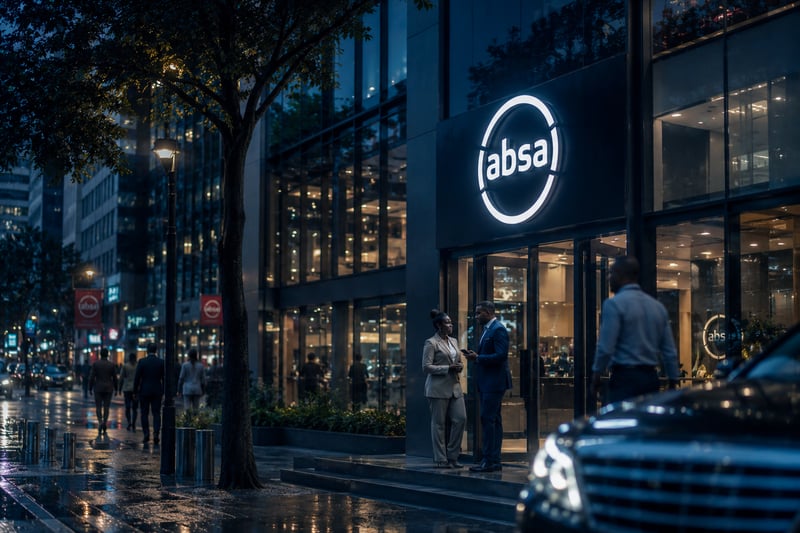
Read Absa's story
Absa
Insurance

Delivering customer-centric health care technology across time zones

Read Bupa's story
Bupa
Related Industries

Powering digital platforms at scale for Africa's leading telco

Read MTN's story
MTN
Financial Services

Transforming investment platforms and digital channels for a global asset manager

Read Ninety One's story
Ninety One
Insurance

Driving digital transformation for a global reinsurance leader

Read RGA's story
RGA
Financial Services

Driving innovation at scale for one of Africa's largest financial services groups

Read Sanlam's story
Sanlam

Story Herostory-hero

The big opening banner at the top of a customer story page, with a full-width photo, the customer's name, a headline and a row of standout numbers.

This is the large banner that sits at the very top of a customer story page. It shows a full-bleed photo that fades into the dark background, the customer's name, a big headline, and a few key results.

What you can change

  • The customer name shown as a small label above the headline
  • The main headline
  • The large background photo (leave it blank to use the built-in one)
  • The row of standout numbers below the headline — each has a big figure and a short description; add or remove as many as you like (four fit nicely across)
  • The background colour and the spacing above and below
Live example

Capitec

Powering digital banking for South Africa's largest retail bank

13M+

Digital clients served through Capitec's rebuilt mobile banking app.

R60M

Saved per annum by reducing third-party licensing fees through security re-platforming.

99.88%

App stability achieved for Capitec's Retail Banking app, ensuring reliable digital banking at scale.

18%

Reduction in call handling time through AI-powered contextual client support.

Story Highlightsstory-highlights

A row of icon cards that showcase the standout wins from a customer story or partnership.

Use this section to spotlight the biggest results or achievements from a project, one card at a time.

What you can change

  • The small line of text above the heading, and the heading itself (you can make some words stand out)
  • Each highlight card: its little picture, its title, and a short description
  • Add, remove, or reorder as many highlight cards as you like
  • The background colour and the amount of space above and below the section
  • The soft background glows, and which moving background wave shows behind the cards — plus its position (nudge left/right, up/down), rotation and opacity

On a big screen the cards glide across sideways as you scroll; on a phone you swipe through them one by one. You can also drag the cards directly — grab one with the mouse and throw it, and the row carries on gliding for a moment before it settles, the same way a flick behaves on a phone.

Live example

Our Partnership Highlights

Highlights of what
we've built together

Eight-petal flower outline icon

#1 Downloaded Banking App in South Africa

Entelect rebuilt Capitec's mobile app, helping it become the top finance app on Google Play, serving 13M+ digital clients.

Radiating sunburst icon

Saving Capitec over R100M per annum

Through security re-platforming, Entelect was able to reduce Capitec's 3rd party licensing fees by over R100 million per annum.

Concentric circles radar icon

Cutting edge fraud detection across every transaction

We've delivered a unified, event-driven risk system that significantly improved fraud prevention and response times.

Eight-pointed star outline icon

World-first AI-powered contextual client support

Our teams introduced contextual, AI-powered agent enablement - cutting call handling time by 18% and boosting performance by 26%.

Eight-petal flower outline icon

Zero-rated in-app calling

Together, we launched seamless in-app calling with no need for data, airtime, or re-authentication - frictionless support for millions.

Dashed circular burst icon

Large-scale cloud data migration

Successfully migrated over 15 years of data (~20TB) into the cloud, reducing operational risk and future-proofing Capitec's data platform.

Wireframe globe icon

High platform stability

The Retail Banking app has achieved ~99.88% app stability, ensuring a reliable and consistent banking experience at scale.

Story Impactstory-impact

Sums up the results of a customer partnership with a headline, a photo, a couple of standout numbers, and a list of the areas you worked in.

Use this near the end of a customer story to show the difference your work made — a strong statement, a photo, key numbers, and the parts of the business you were involved in.

What you can change

  • The small label above the heading, and the heading itself
  • The short paragraph of text beside the heading
  • The two big numbers and the short caption under each one
  • The heading for the list, and the list of business areas (the numbering is added for you)
  • The background colour and how much space sits above and below the section
  • The soft background glows — turn them on or off, and set their colour, size and position
Live example

entelect at capitec

One Team.
Shared Ownership.
Proven Impact.

Entelect's partnership with Capitec is defined by deeply embedded, high-performing teams that operate as one with Capitec. Through engineering excellence, scalability, and a shared culture of ownership, we've delivered the innovation and engineering standard that defines Capitec's digital experience.

5

Years of working together

180

People embedded in Capitec teams

We've worked across multiple
critical business units

  1. 01. Retail Banking
  2. 02. Connect
  3. 03. Centralised Electronic Desk Branch
  4. 04. Card
  5. 05. Forex
  6. 06. Fraud and Anti-Money Laundering
  7. 07. Conversational Banking
  8. 08. Value-Added Services
  9. 09. Live Better Rewards
  10. 10. Product Engineering
  11. 11. Client Domain
  12. 12. Business Banking: Platform Engineering
  13. 13. Data Platforms
  14. 14. Business Banking

Story Introstory-intro

A short intro band for a customer story, showing the customer's logo, a few category tags, and a paragraph about who they are.

This is the little introduction band near the top of a customer story. It shows the customer's logo, a few category tags, and a short paragraph about them.

What you can change

  • The customer's logo (leave it blank to use the default one)
  • The category tags shown as small labels (for example "Banking" or "Financial Services")
  • The short introduction paragraph about the customer
  • The background colour and how much empty space sits above and below the band
  • The soft glowing shapes in the background — turn them on or off, and change their colour, size, and where they sit
Live example
BankingFinancial Services

Capitec serves 25 million clients, making it the largest bank in South Africa by client base. With a market capitalisation of over R535 billion and a reputation as one of the country's most successful disruptors, Capitec is known for simplifying banking through a highly accessible and digitally-led experience.

Testimonials Slidertestimonials-slider

Shows customer quotes one at a time in a rotating slider you can flip through.

Use this section to feature what your customers say about you, with their name, role and photo.

What you can change

  • The heading shown above the quotes
  • A small line of intro text (the eyebrow) above the heading, used in one of the looks
  • Each testimonial: the quote itself, the person's name, their job title or role, their photo, and (optionally) a link the photo opens — e.g. the person's LinkedIn profile
  • Add as many testimonials as you like — with just one, the slider stays still; add more and visitors can flip between them
  • The background colour behind the section and the space above and below it

Comes in 3 looks

  • Contained — the quote sits inside a soft, glowing card in the middle of the section
  • Full width — the quote stretches edge to edge with the glow filling the whole section
  • Split — a heading on the left and the quote with next/back arrows on the right
Live example — Contained (glass card)

What our clients say

Entelect operates as a true extension of our teams — there's no distinction between us and them, just a single, unified team working towards the same outcomes.

Ravindern Govender Ravindern Govender Chief Information Officer

What stands out most is their commitment to high engineering standards — they don't just deliver, they elevate the quality of everything they touch.

Thandiwe Mokoena Thandiwe Mokoena Head of Digital Platforms
Live example — Full width

What our clients say

Entelect operates as a true extension of our teams — there's no distinction between us and them, just a single, unified team working towards the same outcomes.

Ravindern Govender Ravindern Govender Chief Information Officer

They elevate the quality of everything they touch — deep ownership, high standards, and a real investment in what we're building together.

Thandiwe Mokoena Thandiwe Mokoena Head of Digital Platforms
Live example — Split (heading left, quote right)

Customer testimonials

Hear it from
our customers

Entelect operates as a true extension of our teams — a single, unified team working towards the same outcomes, adapting quickly as our needs evolve.

Ravindern Govender Ravindern Govender CIO of Retail, Capitec

They don't just deliver — they elevate the quality of everything they touch, with deep ownership of what we're building.

Thandiwe Mokoena Thandiwe Mokoena Head of Digital Platforms

Work Spotlightwork-spotlight

Spotlights one piece of work with a short intro, a click-to-expand list of details, and a large image alongside.

Use this to feature a single story — a client project, a capability, or a delivery example — with a scannable headline and details people can open one at a time.

What you can change

  • The small eyebrow line, the main heading, and the short intro paragraph
  • The expandable items — each has a title and some text, and the first one starts open
  • Each item's glow colour — the soft halo behind its picture while it is open (plain style). Leave empty for the default blue; set it to match the picture's own colour.
  • The large image shown beside the list (or a separate image for each item, which swaps in as that item is opened)
  • The background colour and the amount of space above and below the section
  • The soft background glows — turn them on or off, and set their position, size and colour

Comes in 2 looks

  • Framed (photo card) — the image sits in a rounded photo card. Best for real photography.
  • Plain (floating art over a glow) — no card frame; the image floats on the background over a soft glow. Best for icons or illustrations.
Live example — Framed (photo card)

Our Work

Capitec: Modernising retail banking for 14 million app users

Capitec set out to modernise their retail banking application for millions of South African users. We helped transform their technology foundation to make that possible.

Capitec's existing app tech stack was reaching end of life, limiting the bank's ability to innovate quickly. Slow feature rollouts and limited scalability were hindering delivery against evolving market demands and user expectations – while proprietary licences were adding unnecessary cost.

We re-platformed the app onto a modern, cloud-native, open-source stack — rebuilding the architecture for scale and faster feature delivery, and removing costly proprietary licences, without disrupting the millions of customers who bank every day.

The new foundation lets Capitec ship features faster, scale comfortably to 14 million+ app users, and cut operating cost — on an engineering base built for continuous evolution.

Capitec app users on a city street
Live example — Plain (floating art over a glow)

Global Delivery

Our global
delivery capability

Entelect operates delivery hubs across South Africa, the United Kingdom, Australia, New Zealand, the Netherlands, India and Zimbabwe. Our model is built to give you access to the right skills, at the right cost.

Engage directly with the team doing the work – named, accountable, native English-speaking, and expert problem-solvers.

Our onshore technical leads, architects, and product owners work alongside you in person, backed by a South Africa-based offshore delivery team.

With 2,500+ qualified and experienced engineers spread across our global hubs, we have the depth to match the right skills to your project, regardless of location.

Delivery teams are structured around overlapping time zones, enabling shared ceremonies, real-time collaboration, and faster resolution when things need attention.

Wireframe globe pictogram Eight-petal flower pictogram Eight-pointed star pictogram Radiating sunburst pictogram